Acrylic Paints: Opaque vs. Translucent/Transparent

I’ve been asked what the difference is between transparant and opaque paints and how you apply them to the canvas to get a variety of effects. It is also challenging to tell if a paint is opaque or if it is transparent (translucent) by just looking at the paint on your palette.

I have used Titanium White vs. Zinc White to illustrate the difference in opaque and translucent Acrylic Paints in the picture above. Titanium white is an opaque paint and zinc white is a translucent paint. A good way to think of this is opaque paint is not see through and translucent/transparent paint is see through. In the photo you can see the blue paint peeking through underneath the zinc white, but the titanium white hides all of the blue paint underneath it.

I also painted in with gesso to show how it is in between transparent and opaque. This is why I always paint two to three coats of gesso when preparing a painting surface.

Definitions of the two pigments or paints:

Translucent/Transparent Paint: When an object is dyed to be translucent, it allows more light to pass through, reflecting off the objects behind the surface and allowing them to reflect their own color wavelengths, increasing their visibility. When applying translucent paint over the top of another color of paint, it allows the lower color to show through creating an “mixed” color of the two different colors.

Opaque Paint: A paint color is said to be opaque when it hides what’s underneath it. When you can’t see any or very little of what’s painted beneath the color, it is an opaque paint. If you can see a color that is underneath, then that paint is just the opposite of opaque, it is transparent.

Semi Transparent and Semi Opaque Paints: And just to confuse all of us, there are also may paints that are in between. They are classified as semi transparent (more transparent than opaque) and semi opaque (more opaque than transparent.)

I made a list of the transparent and opaque paints I use regularly as a reference sheet in my studio. I have shared it below. These are my personal favorite colors I use the most, there are many other colors created by paint manufacturers. I use Grumbacher, Golden and Liquitex acrylics.

Transluscent/Transparent Paints (includes semi transparant)

Zinc white, alizarin crimson, dioxazine blue, ultramarine, pthalo blue, Prussian blue, viridian green, terre verte, sap green, burnt sienna, raw sienna, raw umber. Even though raw unber is on this list, I think it covers really well.

Opaque Paints (includes semi opaque)

the cadmium’s: yellow, red, orange. Lemon yellow, yellow ochre, burnt umber, Vandyke brown, Paynes grey, ivory black, cerulean blue, cobalt blue, chromium green, Indian red, and titanium white.

I have found that using semi opaque or semi transparent paints in my painting process is the best way to get familiar with how transparent/opaque they appear.

Color Mixing

Mixing a transparent paint with an opaque paint can make it more opaque. As an example, I mix sap green which is semi-transparent with a tiny bit of cadmium yellow and it covers more like an opaque paint.

Some brands of paint have begun using a chart from 1 to 8 to determine the opaqueness of each paint. Most paints have a transparancy/opaque reference on the tube, but if you don’t see it, refer to their website for that and more information about each type of paint.

Water Based Mediums

There are also all types of water based add ins and Mediums that can change the density of your acrylic paints, too. But that’s a huge topic for later!

Let me know if you find this helpful!

Have a wonderful, creative, day filled with joy! -Janell

P.S. Yes, I am back to blogging after taking a couple of years off. I so enjoy talking about art and painting and sharing my processes and experiments that I decided to get back to blogging. 😊

Advertisement

Green, Trees, Painting, a Few of My Favorite Things…

I love green! I suppose then, it is natural that the color green just seems to appear in most of my paintings. In this painting, I was feeling the need to escape and relax. I love trees and painting them relaxes me.

Painting LUSH by Janell Mithani


The title of this painting is   “LUSH” 10″ x 10″, acrylic on canvas.  Thanks for stopping by my blog, I appreciate you taking the time to look at my art.


Have a wonderful, creative, day, Janell

Aqua, A Mermaid Painting

Aqua, a sweet little mermaid slumbering in the waves.  I love the colors of this painting.

mermaid painting by Janell MIthani 
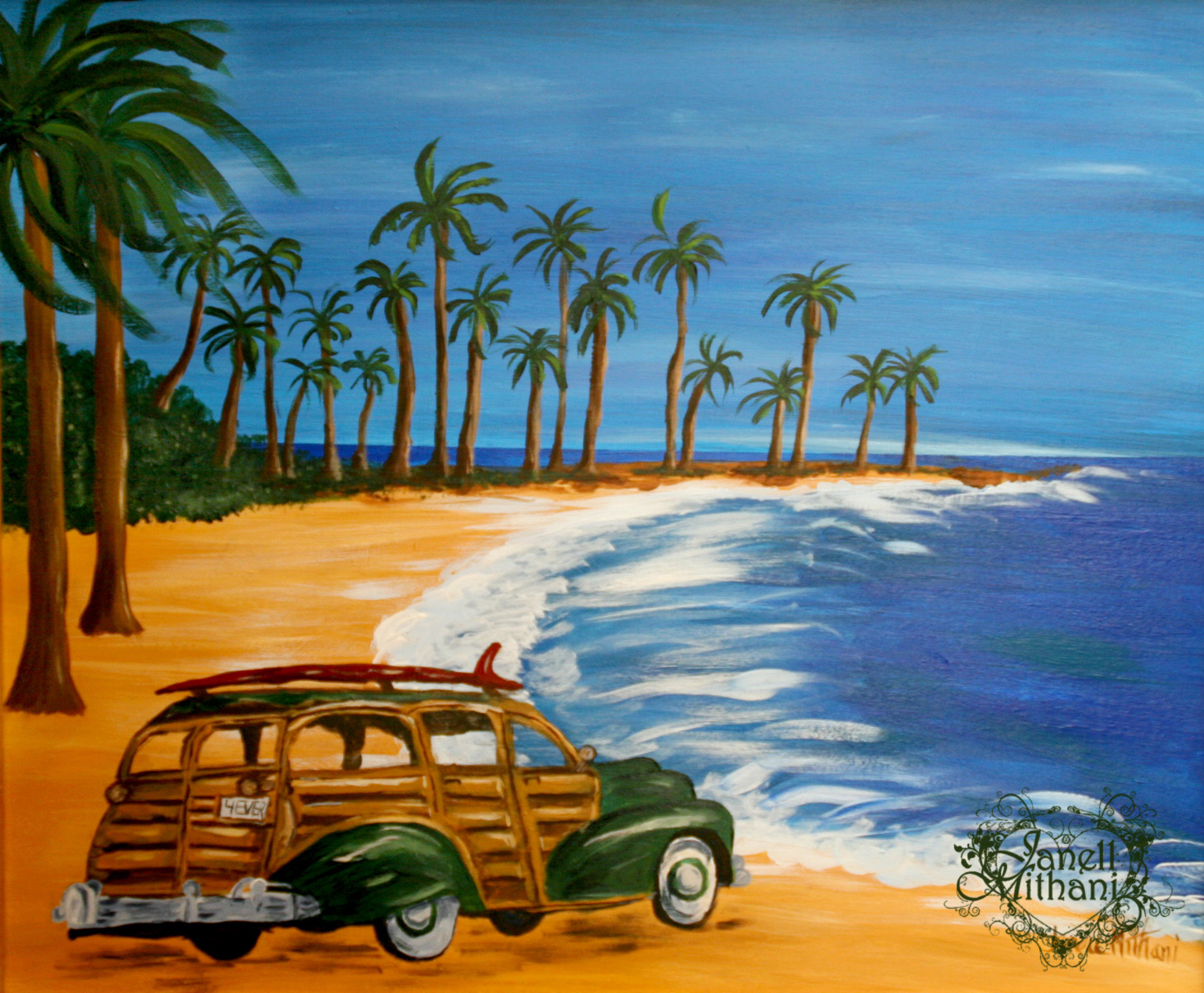
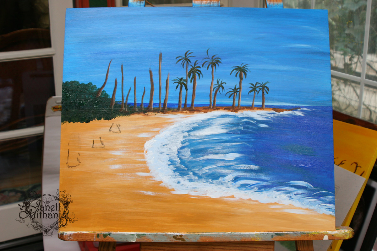
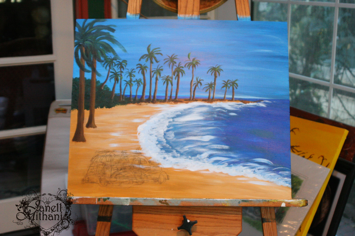
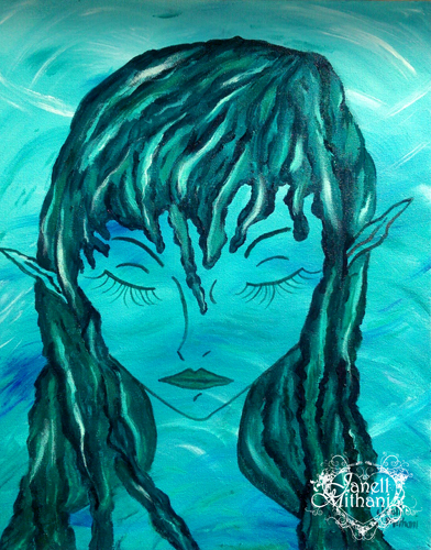
I did some traveling in September, visiting family in Oregon.  I had a wonderful trip, and it took me a week or so to wind down and get back to work in the studio.  This week, I got back to my paintings and this painting was still sitting on my easel, almost finished.  She seemed to be calling to me… 🙂  Finish me, please!

Here are a few pictures of my creative process.
sleepingbMy original sketch waterfaeblog
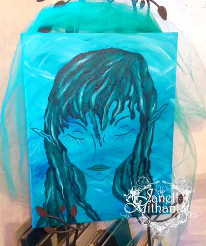
The background is painted and then I sketched in the mermaid with charcoal.
mermaidfinished
mermaidinprocess

Finished painting with a bit of tulle that I had in the studio.


Have a wonderful, creative, day, Janell


Wings and a Different Style of Painting

I have been working with a limited palette lately.  This painting is more abstract than my usual paintings. I have been studying birds and wings in particular, lately.  So as a result, I have a lot of wing sketches.  I really felt compelled to paint this with a limited palette.

wings painting by Janell Mithani

Heart Wings, Acrylic on Canvas, 11″ x 14″

I just used three paint colors:  titanium white, burnt umber and paynes grey.  I worked on it for three different days, finishing it within a week.  Much faster than my more detailed Fae paintings.  I would love to hear what you think about it and the different painting style.

Have a wonderful, creative, day, Janell

New Gallery Representation at Xanadu Gallery

In the midst of all our holiday celebrations, I submitted my portfolio to Xanadu Gallery of Scottsdale, Arizona.  My art was accepted to their online gallery!  Yippee!  I am so thrilled to be associated with this wonderful gallery.  And they notified me and had my page set up within 24 hours.  (Even though their submission guidelines said two weeks.)  It was really nice of them to be so  prompt, it kept me from worrying and wondering for two weeks. 🙂

You can check out my page at http://www.xanadugallery.com/2013/Artists/ArtistPage.php?ArtistID=4361

I am still in the process of loading my art to the site and I LOVE how the purchase button is all set up.  It takes you to a shopping cart that gives you payment options.  I haven’t had the time to figure out how to set this up on my Artspan website.  It’s so nice to have it all done for me.

Painting Serenity in a Daffodil Meadow by Janell Mithani

Serenity in a Daffodil Meadow, Acrylic on canvas, 16″ x 20″

I met Jason Horejs, the owner of the gallery a few years ago at a workshop he taught for artists.  His workshop was really helpful and he was so nice and gracious to all the artists that attended.  He has written some great books to help artists with the business side of their art.  Here is a link to the landing page with his books https://squareup.com/market/xanadu-gallery.  He also writes a blog http://www.reddotblog.com/wordpress/  which is a great marketing resource for artists.

If you are an artist and you are interested in submitting your portfolio, here is the link: http://www.xanadugallery.com/Studios/Join.asp

Have a wonderful creative day,  Janell

A Painting for My Husband…

I painted this beach scene for my Husband for Christmas.  BeachSceneSmallLogo

I finished it on Christmas Eve, just in time to pop it into a frame I had in the studio.  He has always loved the “Woody” car with a surf board on the top.  Living in Southern California, he and our daughter have had a lot of fun spotting them when we are hanging out at the beach.  Green is both of our favorite color, so it had to be a green car.  I think this is the first time I have ever drawn and painted a car.  I finally put the hanging hardware on the back of it this weekend so he can hang it up in his office.

Here are a couple shots of the progress of the painting.

Beginningofpainting

I am just beginning to get the palm trees sketched and painted in..

WithPalmsin

This is the painting of the beach, I just need to add the car.

carsketchedin

With the car sketched in…  I did a pretty detailed drawing in pencil on paper and then did the old-fashioned transfer of scribbling on the back of the paper with charcoal and tracing over my sketch to transfer the line drawing into my painting.  It works great, I also sometimes use white charcoal or soft pastel if I am transferring onto a darker painted surface.  If you mess up you can just brush it off with a paper towel.  Also, if you don’t want charcoal all over the back of your sketch, you can take a photo copy of your sketch and use the copy for your transfer.  I use this process a lot when I want to “Ink” one of my Manga drawings, too.

Wish you a wonderful creative day, Janell

Garden Cottage Painting

Happy New Year!  Here is a painting I made titled “Garden Cottage.”

CottageFinalL

I think I would like to escape to this little cottage and spend the day painting. 🙂  I am really enjoying acrylic painting again, I  just started again three months ago after about a 20 year break.  This is the second painting I did this past Fall.  I have done other mixed media work and I am still experimenting with the style and brushwork I like best.  But I think my style is emerging…

I didn’t get much painting done in December, although I did make a painting for my husband for Christmas.  Of course, I finished it the day before and popped it into a frame I had out in the studio just in time to tuck it under the tree.  I have switched to working in acrylics instead of oils and I like the faster drying time.  I have always painted fast a furious!  So working in acrylics goes along with my style and much easier cleanup.  I am really liking the full body acrylics, especially the ones by Golden.  And all the textures and mediums…

I also love to take pictures and have a huge library of images on my computer to choose from.  So I have no loss of subject matter, now… just need to make more time to paint in 2013!

I have been looking over art books and studying different techniques and brushwork applications as I work on developing my style.  I just love research, actually sometimes I think I get so wrapped up in research that I can’t seem to get time at my easel.  Below is the painting on my easel at about 2/3 of the way finished so you can see a bit of my process.  I did a lot of toning down of areas to bring the focal attention to the little cottage.  I also added some yellow and warmed up the tone of the painting.  The finished painting is on a panel with 3″ deep sides and is 11″ x 14″.

Cottage preliminaryL

Wishing you a wonder fun-filled creative year!    Janell